Module: MMc401.3 – Graphic Design and illustration
Motion Graphics
For this project I will
be creating/developing a 20 frame storyboard for a 15 second animated motion
graphic, which is going to be based on my pervious typography assignment which
I did before. Therefore before I start developing my ideas I will need to
research on motion graphics and understand what it is.
After looking into
websites I later found out that “motion graphics is a digital technique that
combines pictures, words, sound and video.” I also found out that “Motion
graphics combine the languages of film, animation and graphic design. Combining
different creative elements like typography, illustration, logos, shapes and
video. Then they are then animated or moved in a way that tells a story.”
http://www.alboardman.com/what-is-motion-graphics/ using
this website I got the clear understanding of what motion graphic is and was
able to retrieve information.
https://vimeo.com/100506924 this is a simple motion graphics video which
uses simple shapes and colours with sound.
After researching about
motion graphic I then started to look into typography, researching about
typography was easy as I had previously done the project before. But I never
really understood the meaning of typography so therefore I started to look for
answers by researching and as a result I did get my answers to my question.
With the help of this
website I was able understand what typography is about and how it works and how
it is suppose be utilised. I thought to myself when developing my idea I need to
focus on the how my typography/font is going to look like. I did some research
on some existing typography to get ideas and to know how most of the text are
utilised.


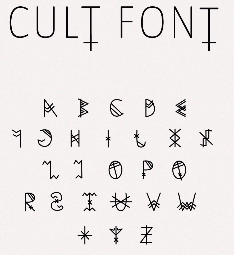
I looked into few of
these typography example to get an idea of how my text is going to look
like.(images link) https://s-media-cache-ak0.pinimg.com/236x/4d/40/ef/4d40ef18f89b97c566624076947a9791.jpg
As you may already know “A storyboard is a graphic organizer in the form of illustrations or images displayed in sequence for the purpose of pre-visualizing a motion picture, animation, motion graphic or interactive media sequence. The storyboarding process, in the form it is known today, was developed at Walt Disney Production during the early 1930s, after several years of similar processes being in use at Walt Disney and other animation studios.” I retrieve this information from Wikipedia.
 This is an example of how a storyboard looks
like and how it is structured. After looking at the storyboard I now had the
idea and concept of how I will be laying out my ideas and structure it.
This is an example of how a storyboard looks
like and how it is structured. After looking at the storyboard I now had the
idea and concept of how I will be laying out my ideas and structure it.

https://en.wikipedia.org/wiki/Kinetic_typography

Here is great example of
what a kinetic typography looks like with the use of audio.

After that I started looking into movie title
sequence as motion graphic are used a lot for movies.


This is a movie title
sequence from Catch me if you can. After looking at the video I was truly
inspired to do something similar as it was very detailed and eye catching. So I
started looking at more of movie title sequence in order gain more ideas. The
stick man figure made the introduction a lot better as it was tells the
audience what the story is about. The audio sync in with the motion and the use
of lines on text catches the audience eyes. The use of colours is also great as
it stands out and it looks neat and tidy in my opinion. After looking at this
video I thought about using straight lines in my text as it looks unique and
stands out.
After looking at the previous movie title
sequence I started looking at more of movie title sequence as I really enjoyed
watching it.


This is also a movie
title sequence from Casino Royal. As you can see the art work in this opening
is amazing and very details, the use of patterns and the use of colours makes
it really hard to look away. What I like about this video movie title sequence is
the art work, the use of colours and the use of patterns makes it look very
artistic. The disadvantage for me is that I am not use to the software so
therefore I can’t create it in this style yet so therefore I will be looking at
something much simpler.


This is also a movie
title sequence from Captain America: The Winter Soldier. The use of black and
white colours really makes this movie title shine as it looks amazing and it is
very details. The use of black and white makes it look neat and tidy in my
opinion, therefore in future I will be doing something a lot more similar to
this work. I also think that the artwork is really amazing and very detailed
with just one fill colour.
After looking into
different movie title sequence, I started looking for different video so therefore
I went on this website and looked at different motion graphics videos.


This is video created by
Ogris Debris – See The World as you can tell the title speaks for itself, this
video is about seeing the worlds and it has a great visual style. The art work
is fantastic and very original
After looking at the
pervious video I started looking at more videos as each and every one of the
videos had different style and effects which I could learn in future.


The video is very
artistic and it is well structured as everything happens in the centre so
therefore its gets the audience to focus, the use of the square box makes it
users to focus inside the box. In future I hope to learn to be able to create
something similar to the videos l have looked at.
I looked at this video
as the art work were simple and it didn’t use many special effects comparing to
the other videos.


The art work in this
video is simple yet neat and detailed. In my opinion I really like this sort of
style as it’s simple yet effective. The use of colours is well matched and it’s
structured well. But after looking at all of these videos and exiting ideas I
need to limit myself as I don’t have the ability to create something similar to
what I have been look at/ researching. But after doing my research I have found
different way to develop my ideas which requires less skills and experience
using the software.
References
Love it its awsame end i cant stop watching
ReplyDeleteMotion Graphics